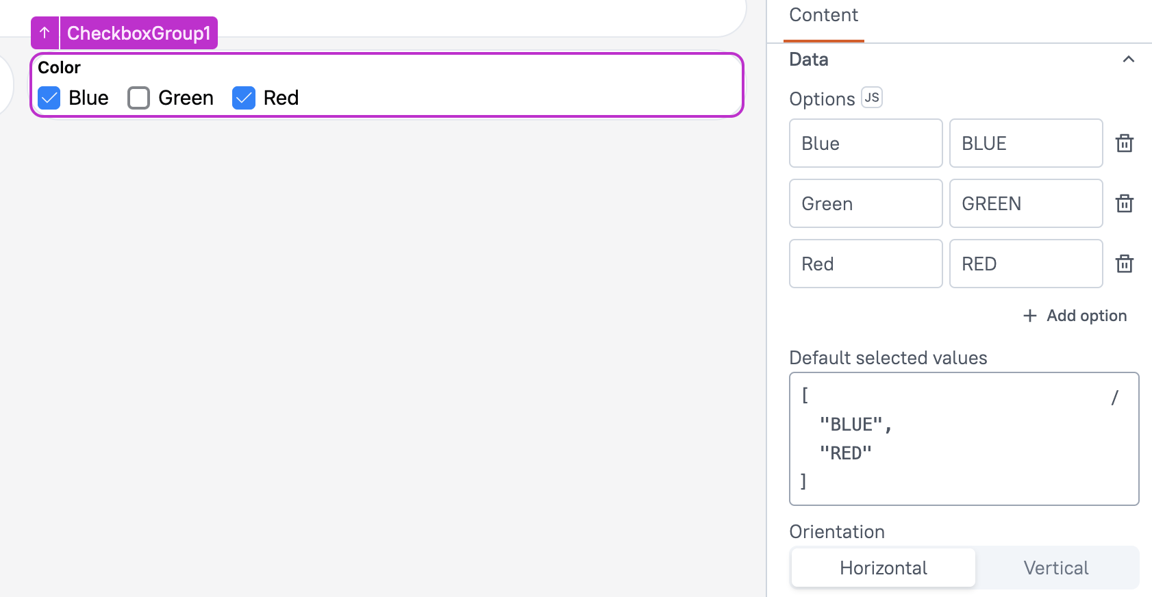
Checkbox Group (AI Assistant)
This page provides information on using the Checkbox Group widget(available in AI Assistant Apps), which allows users to select multiple options from a list. It is useful in scenarios where multiple selections are required, such as choosing preferences, filtering data, or managing user inputs in forms.

Content properties
These properties are customizable options present in the property pane of the widget, allowing users to modify the widget according to their preferences.
Data
Options String
This property allows you to set the labels and values for the items. You can add these labels and values directly from the user interface or use JavaScript by providing options in JSON format, like:
[
 {
   "label": "Option1",
   "value": "OPTION1"
 },
 {
   "label": "Option2",
   "value": "OPTION2"
 }..
]
Ensure that the values assigned to each option are unique. Additionally, you can dynamically display data by using JavaScript. For instance, you can use the .map() function to transform the data to the desired format, like:
{{getdata.data.map( p => ({label: p.country, value: p.country}))}}
Default Selected Values String
Allows you to set default options in a widget. These options are initially selected when the widget is loaded, representing the user's default input unless modified. Multiple default items can be added by providing them as an array of values. For example:
[
 "OPTION1", "OPTION2"
]
Orientation
Allows you to set the layout direction of the checkboxes in the Checkbox Group. You can choose between:
- Horizontal: Displays the checkboxes side by side in a single row.
- Vertical: Stacks the checkboxes in a column.
Label
Text String
Defines the label for the entire Checkbox Group widget. This label serves as the heading or title, providing context for the group of checkboxes.
Tooltip String
Allows you to add a tooltip that appears when the user hovers over the Checkbox Group widget. This can be used to provide additional information or instructions about the entire set of checkboxes, helping users understand the purpose or expected input for the group.
Validations
Required Boolean
This validation feature allows you to designate the Checkbox Group as a mandatory field. For instance, when the Checkbox is placed within a Form widget, enabling the Required property ensures that the Form's submit button remains disabled until the Checkbox Group is checked.
General
Visible boolean
This property controls the visibility of the widget. If you turn off this property, the widget would not be visible in view mode. Additionally, you can use JavaScript by clicking on JS next to the Visible property to conditionally control the widget's visibility.
For example, if you want to make the widget visible only when the user selects "Yes" from a Select widget, you can use the following JavaScript expression:
{{Select1.selectedOptionValue === "Yes"}}
Disabled boolean
This property prevents users from selecting the Checkbox widget. Even though the widget remains visible, user input is not permitted. Additionally, you can use JavaScript by clicking on JS next to the Disabled property to control the widget's disable state conditionally.
For example, if you want to allow only a specific user to interact with the Audio Recorder widget, you can use the following JavaScript expression in the disabled property:
{{appsmith.user.email=="john@appsmith.com"?false:true}}
Animate Loading boolean
This property controls whether the widget is displayed with a loading animation. When enabled, the widget shows a skeletal animation during the loading process. Additionally, you can control it through JavaScript by clicking on the JS next to the property.
Events
onCheckChange
This event defines the action that would be executed when the user selects or deselects multiple or single items in the checkbox group. It allows you to specify a list of supported actions that can be triggered in response to the checkbox state change.
Reference properties
These properties are not available in the property pane, but can be accessed using the dot operator in other widgets or JavaScript functions. For instance, to get the visibility status, you can use CheckboxGroup1.isVisible.
options Array
The options property is an array that contains the values of all the available options.
selectedValues Array
The selectedValues property holds an array of values that represents the options selected by the user.
isValid Boolean
The valid property indicates the validation status of a widget, providing information on whether the widget's current value is considered valid or not.
isDisabled Boolean
The isDisabled property indicates the disabled status of a widget. It is represented by a boolean value, where true indicates that the widget is not available, and false indicates that it is enabled for user interaction.
isVisible Boolean
The isVisible property indicates the visibility state of a widget, with true indicating it is visible and false indicating it is hidden.
Methods
Widget property setters enable you to modify the values of widget properties at runtime, eliminating the need to manually update properties in the editor.
These methods are asynchronous and return a Promise. You can use the .then() block to ensure execution and sequencing of subsequent lines of code in Appsmith.
setVisibility (param: boolean): Promise
This allows you to change the visibility of widget based on conditions or user interactions within JS.
Example:
CheckboxGroup1.setVisibility(true)
setDisabled (param: boolean): Promise
Sets the disabled state of the widget.
Example:
CheckboxGroup1.setDisabled(false)
setValue (param: object): Promise
Allows you to dynamically set the selected values of the Checkbox Group widget. This method is useful for updating the user's selections programmatically based on specific conditions or data from other widgets or queries.
Example: If you want to preselect an option based on a user’s role:
CheckboxGroup1.setValue([{ label: 'Admin', value: 'admin' }, { label: 'Editor', value: 'editor' }])
setRequired (param: boolean): Promise
Sets whether the widget is required or not.
Example:
CheckboxGroup1.setRequired(true)
See also
- Insert Data – Learn how to insert data into a datasource using widgets.
- Update Data – Discover how to update data using widgets.
- Form – Learn more about the Form widget.